
If you enjoy my blog, here are some other visualisation blogs (my favourites!) that you might like to sign up to for interesting updates
- Flowingdata (particularly their Visualisation category) has a wide collection of very regular posts from different contributors, with some of the best in this post:
 One of my favourites was Nathan Yau’s on eye-movements of a pianist here, and on demonstrating the many comparable ways to visualise a single set of data (here).

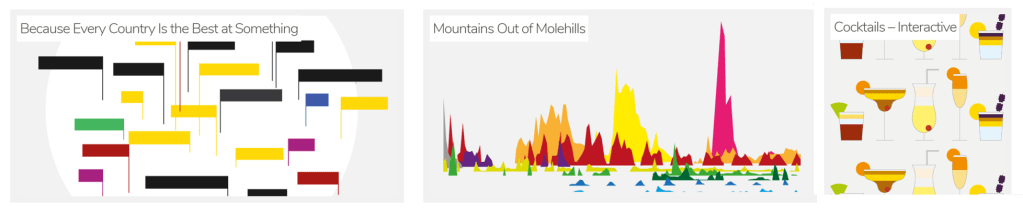
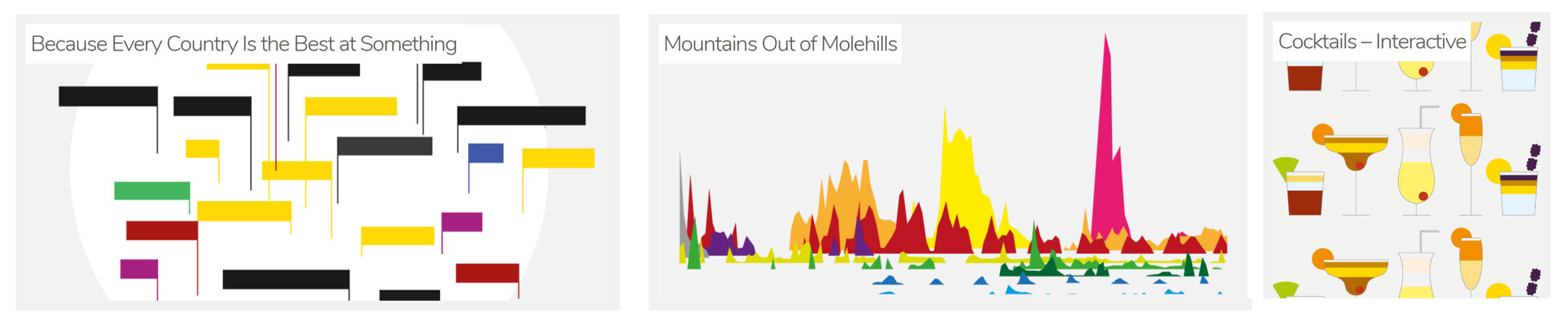
- David McCandless is an independent data journalist and information designer, seeking to visualise information in graphical ways that anyone can understand. He has a blog to accompany his book “Information is Beautiful”: http://www.informationisbeautiful.net/. I particularly like his interactive post on “Mountains out of Molehills” on how much the world’s biggest fears have been amplified by media, and an interactive chart on cocktails!
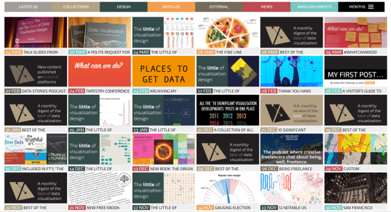
- Andy Kirk was one of the first freelance visualisation designers and has been involved in some really interesting projects as a result. He’s written a great manual called “Data Visualisation: a Handbook for Data Driven Design”, and is now a visiting lecturer at Imperial College, as well as being a freelance visualisation specialist. His blog is at visualisingdata.com/blog/, check out his series on “The Little of Visualisation Design”:
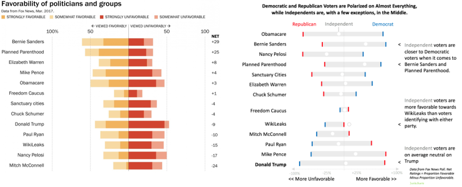
- Kaiser Fung is a data visualisation expert, and was the Web’s first data visualisation critic. In his blog JunkCharts he discusses what makes graphics work, and how to make them better. A US politics example is improved with explanation here:
- Cathy Buchanan writes on CapGemini’s Business Analytics blog, I enjoy her picks of cool visualisations that she’s come across each month, for example from Dec 2015 and this tube “heartbeat” map from Feb 2017:

- Guiseppe Sollazzo has a broader blog on all things data, he works on digital projects at UCL (amongst other things). Sign up to puntofisso’s newsletter to see data-in-action every week 🙂
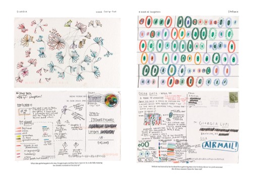
- Dear-data was a project from a series of weekly postcards sent across the Atlantic on a huge variety of personal lifestyle data topics, each with their own explanatory key – for example this one showing the evolution of their laughter that week!
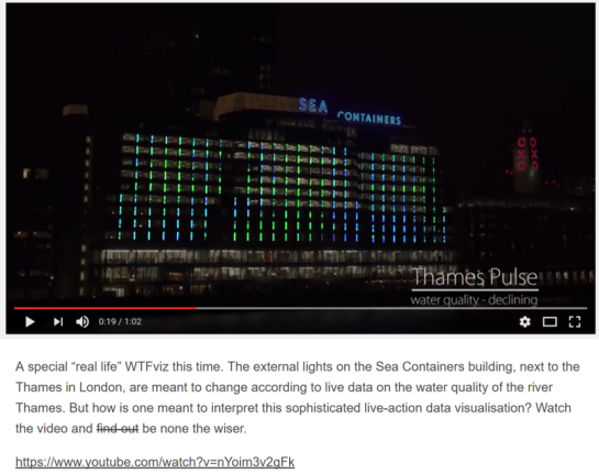
- viz.wtf has a collection visualisations that make no sense, with discussion on why! Highlights include charts that make my head hurt just trying to make sense of them, and a post on how the lights on the Sea Containers building are supposed to show water quality of the Thames – but interpreting it remains a mystery!
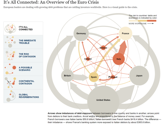
- TheWhyAxis.Info pulls together interesting visualisations that have featured in media, including this (now fairly dated) New York Times article trying to explain the crisis in Europe:
- Others include The Functional Art (Alberto Cairo’s blog on visualisation, infographics and data journalism), Naomi Robbins (teaching others to communicate clearly for decision-making), and Information Aesthetics (a collection from Andrew Vande Moere, a visualisation Associate Professor in Belgium)
Interested to know more about what I do? I’ve just had a refresh of my website, please take a look and let me know what you think!

Leave a comment