
Category: Uncategorized
-
Beauty in the Incas
As you might remember from my last blog, I’m currently travelling and hadn’t intended to post much on here along the way – but there’s just so much in the way of colourful geometric patterns here that I couldn’t resist! I’m in Cusco, typically known as the gateway to Machu…
-
Best of the viz blogs

If you enjoy my blog, here are some other visualisation blogs (my favourites!) that you might like to sign up to for interesting updates
-
GB’s Olympic formula: is medal success the ‘right’ goal for UK Sport investment?
Rio 2016 has seen Britain’s best medal haul in over a century: second in the world with 67 medals. Whilst the more cynical might attribute some of its success to the decline of other nations, it is generally acknowledged that UK Sport’s system of investment lies behind GB’s success. But…
-
Visualisation in Business – Part 3
This follows on from Part 1 and Part 2 in this 3-part special on Visualisation in Business. What types of chart best tell my data’s story? The rule of thumb is to use the simplest chart to showcase your results. Far too many people try to jam their data into a funky type of…
-
Visualisation in Business – Part 2
This follows on from Part 1 “What is visualisation?” in this 3-part special on Visualisation in Business. How is visualisation used in business, what value does it bring? Visualisation can save you time, elicit improved insights, bring your data to life, boil data down to its essence, and best of all, it puts…
-
Half-marathon network maps
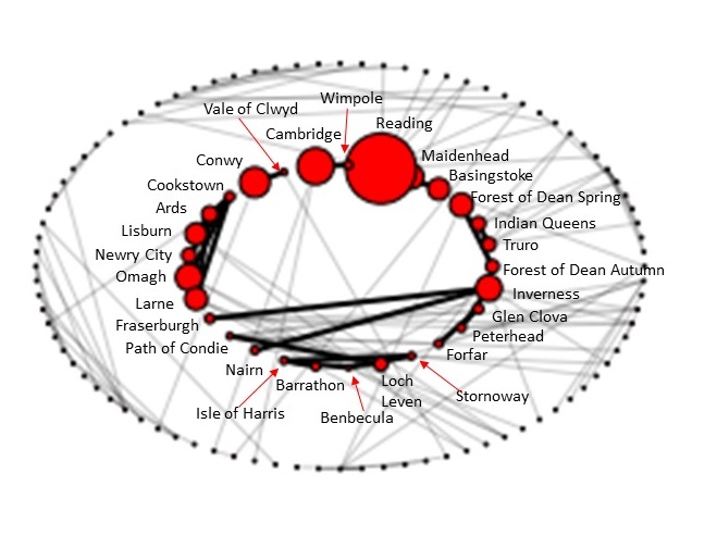
I ran a half-marathon last weekend! It was tough but I think the great thing about running is that you can see so much improvement if you’re prepared to put in some good preparation (using data of course!) combined with a healthy dose of motivation. I felt that the race I entered was dominated by…
-
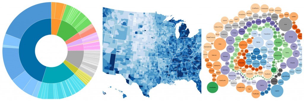
Best of the viz

This time I thought I’d put together a collection of interesting analytic visualisations created by others, with a broad range of applications from dating to transport! Hopefully you’ll find something to interest you too 🙂
-
Why do we need more market data in real estate?

Before getting onto the rationale behind publishing more market data, and having spent the first few years of my career building financial models based on such market data for banks & lenders, I thought I’d start by giving a brief introduction to modelling for those who are not familiar – it’s…
