
Category: Visualisations
-
Issue 8 of the Barometer out now

The Laxfield UK CRE Debt Barometer, with analytics by Elizabeth Martin, was featured in the FT again today. Selected visualisations from the report below!
-
Media visualisations

In my most recent project role, I’ve been working on some visualisations to better describe a media platform’s audience characteristics, amongst other things. Here are some of my favourites (of those that used publicly-available data 😉 ).
-
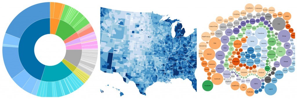
Beauty in maps

I recently found out that visualisation originated from maps – I always knew there was a reason I enjoyed Geography A-level 😉 I remember spending hours poring over maps when I was younger too. Visualisation does not just have its historical roots in maps however – given the various parallels below, the link…
-
Visualisation in Business – Part 1
So far most of my blogs have been on “just for fun” applications, largely because I can’t go into specifics on business applications due to their confidentiality. But it’s the business world that’s really driving acceleration in the field, so I will try to redress the balance here in describing (in suitably broad terms)…
-
Brexit issue of the Barometer: in the FT again today!
The Laxfield UK CRE Debt Barometer, with analytics by Elizabeth Martin, was featured in the FT again today. Selected visualisations from the report below!
-
London transport’s overcrowding: what’s causing it & can we solve it with data?

As featured in CapGemini Business Analytics Blog London’s transport overcrowding has become so pervasive that it has been cited as London’s #2 biggest issue – after the housing crisis, of course, but the two are heavily inter-related. It factored into every mayoral candidate’s manifesto in a big way, and impacts on…
-
Best of the viz

This time I thought I’d put together a collection of interesting analytic visualisations created by others, with a broad range of applications from dating to transport! Hopefully you’ll find something to interest you too 🙂
